
It's no secret that my new favorite Rails stack is Rails + Hotwire + TailwindCSS + ViewComponents. I think this combination provides the best solution for developing great UI in a fraction of the time with simple and easy to follow guidelines.
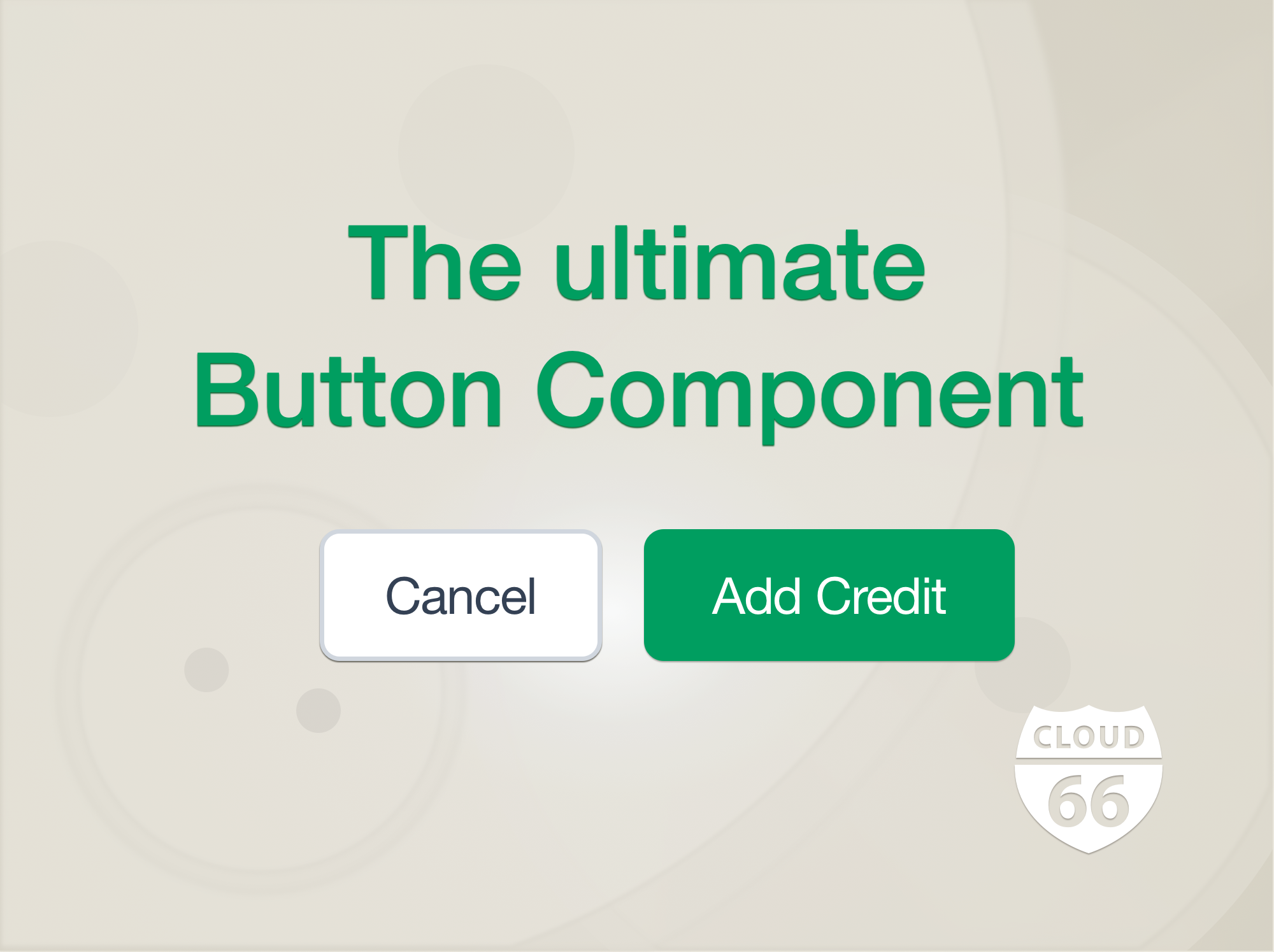
In this post, I want to share our Ultimate Button Component. We developed this button to use in our internal toolset. It's a ViewComponent Button that you can use anywhere in your app and has very little JS, in the form of StimulusJS. I hope you find the button component and the patterns it uses useful in your own projects.
All the code for this post can be found in this repository: https://github.com/cloud66-samples/ultimate-button
Design Requirements
Internal tools are an integral part of making our company scale. We believe in building tools that scale humans so we can offer our services to more customers with less people. However, ironically, building internal tools can easily turn into an onerous activity when you have a small team. Lowering the cost of building and maintaining internal tools is the key to making this equation work.
As such we rely heavily on components to deliver consistent and unified tools to our developers so they can build what they need into our internal tools quickly. This button is an example of this approach.
We wanted our button to be customizable, but also impose our styling standards across all of our tools. We also want to make sure most of new requirements for this button can be integrated into the component so everyone can benefit from them.
Example
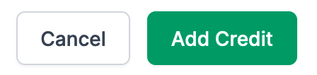
Here's an example of how we use this button:
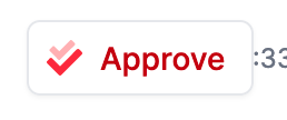
This results in a button that looks like this:
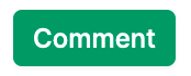
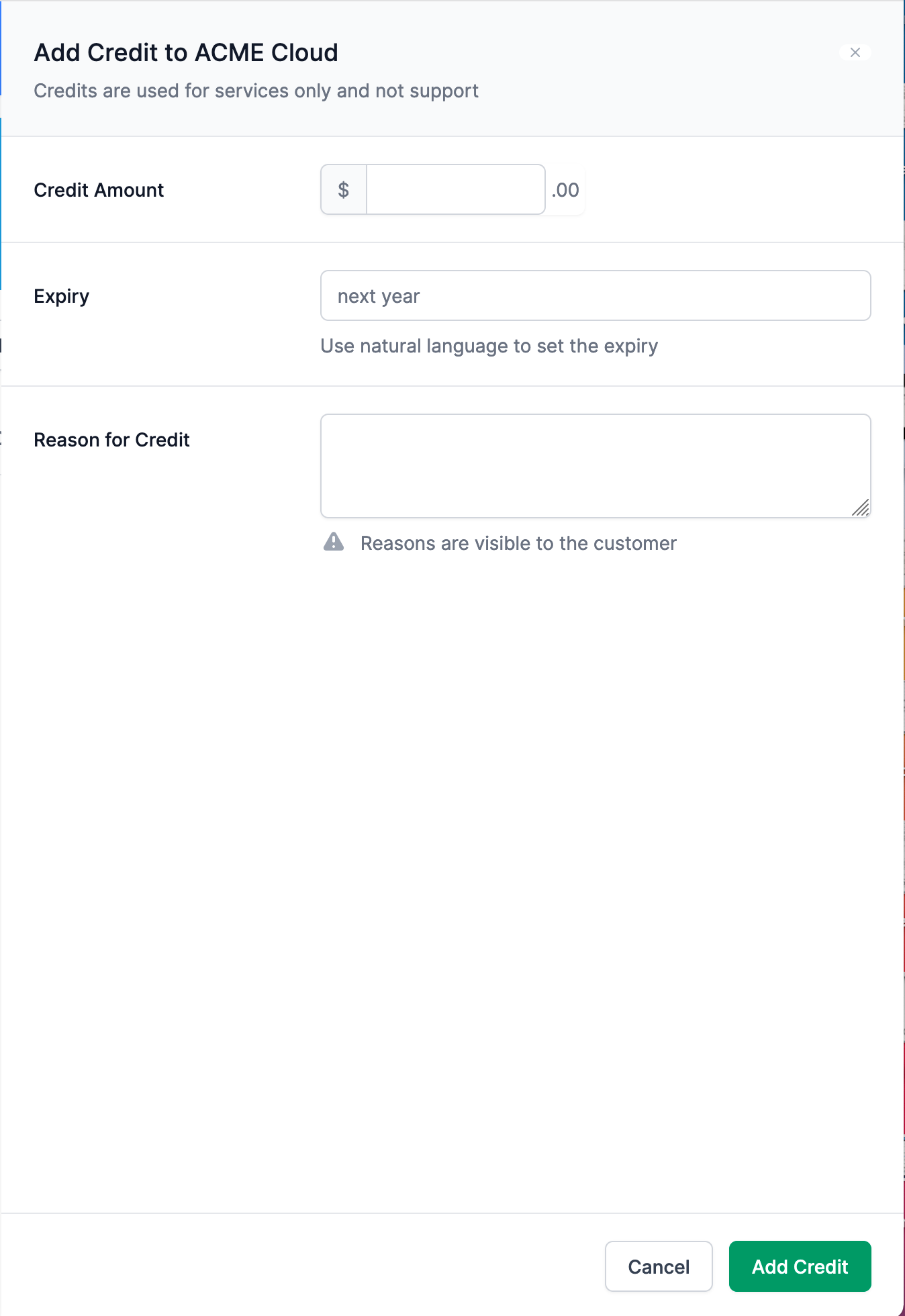
Here is another example:
This code renders this button:
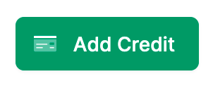
When you click on this button, a panel will slide into the screen. It will contain a form to add credit to an account. More on this one later.
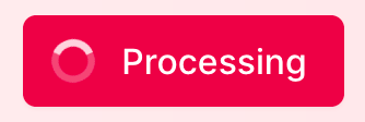
And here's an more complex example:
Which renders this button. It will also show a spinner on the button when it is clicked:
OK, enough examples. Let's take a look at the code a bit. Here is the initializer signature for the button:
Usage
type can be any of these: primary, secondary or tertiary. Each of these have a preset style which can be overridden.
size can be one of these: xs, sm, normal, lg and xl.
For icons, we use our embedded_svg helper you can find here: https://blog.cloud66.com/using-svgs-in-a-rails-stack/ This allows us to store icon sets as Rails assets and address them by their name. For example if we want to use the FontAwesome Regular icon for a "double check", it will be addressed as fa/regular/double-check
color is the name of a TailwindCSS color. If left as default the button will use the default color of the given type. The component will change the color shared based on where they are used in the button.
link is the link the button will navigate to. It can either be a string like /foo/bar or a hash: {options: {}, as_button: false, url: ''}. Any given options will be used in a link_to method as they are provided. as_button determines if link_to or a button_to should be used.
html_options are passed into the render of the link or the button as their HTML options. You can pass anything like class here (see the example above).
role is used as the role of a button HTML tag, like this: <button role="submit">...
slider is used to connect the button to our slider component. We use sliders to provide CRUD operations in the UI without sending the user to a separate page. For example if you want to add credit to an account you'll click on the "Add Credit" button and a slider will slide in from the right-hand side of the screen with a form that allows you to set the amount of credit and other options. We've turned this slider into a component so we can reuse it everywhere. We are going to publish the slider component in another blog post.
transition is the HTML transition you'd like to see when the button is hovered over. By default, a transition duration-300 ease-in-out is set (See TailwindCSS transitions for more information)
spinner can be either true or false or a hash. If it is set to true the default spinner will be shown when the button is clicked.
If a hash is provided then it will be used to determine the look and style of the spinner. The hash can include class, image and color attributes of an icon (usually an animated SVG) to be displayed. If any of these attributes are not provided, the default value for it will be used.
hotkey is used to assign a keyboard hotkey to the button. When the hotkey is pressed, the button click event is triggered. We use Github Hotkey library for this, alongside 2 other JS files (hotkey and popup).
Integration
This is not a copy-and-paste or drag-and-drop component that you can just copy to your project and start using. While you can change it to be less opinionated about where it finds things, or use the code as inspiration for your own button or general component design, as it stands you will need to follow some conventions for how your components are integrated into your projects. I've written about these conventions before here.
In short, you need to make sure you have set up your Rails application with Hotwire, TailwindCSS and ViewComponents and placed your ViewComponents in a folder called components with each component in its own subfolder. You can find a full example of such application here: https://github.com/cloud66-samples/tickerizer
Summary
I hope by unpacking the source code for this component I have been able to share some of the patterns and methodology we use for developing components in our internal tools. While this is not meant to be an 'off the shelf' component, it can be integrated with relative ease into your Rails applications.