Today we are very happy to announce launching our new look!
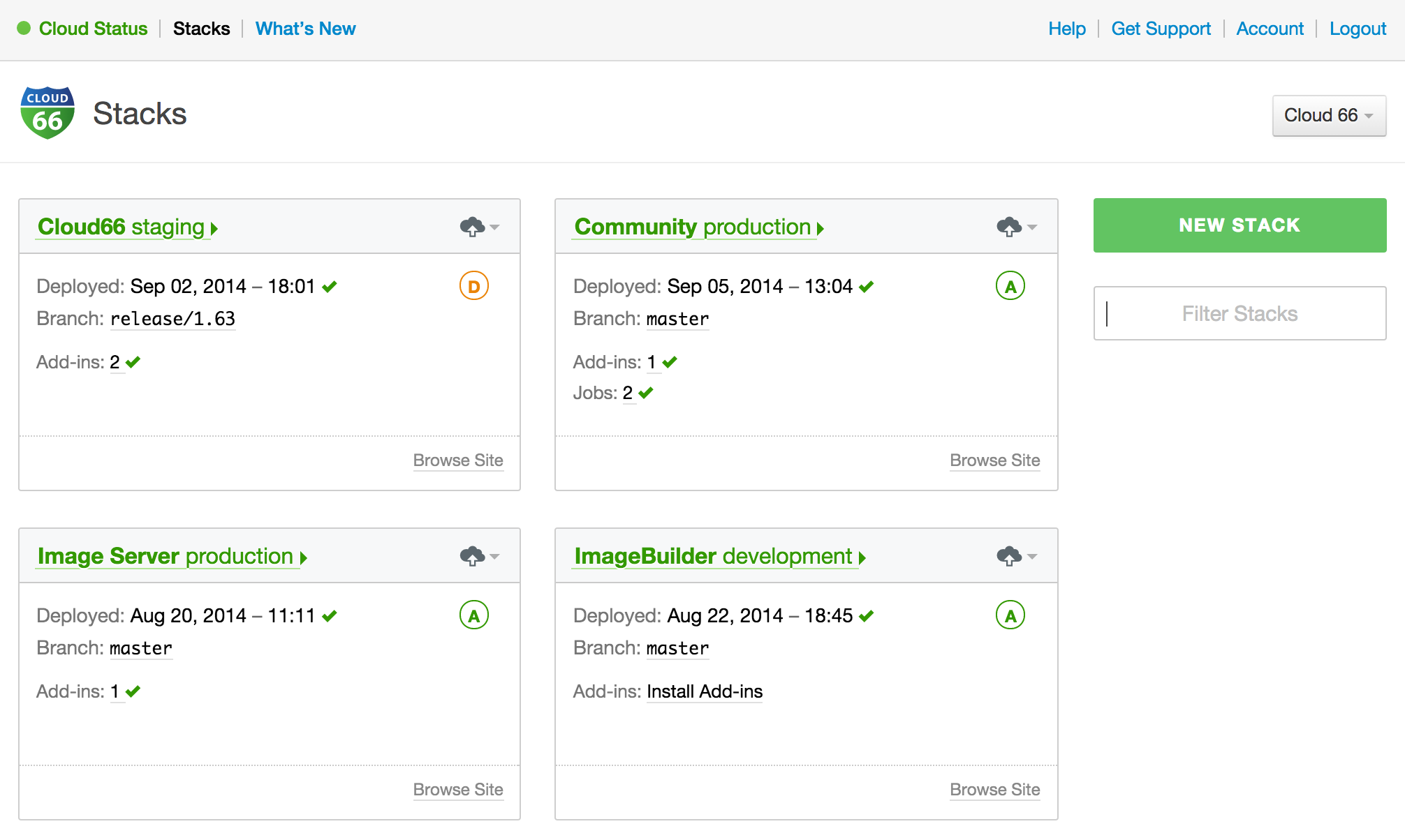
Cloud 66 user interface has had a facelift to make it more intuitive to use and most importantly the dashboard now has a totally new look and feel.

The new features include quicker organisation switch, stack cards on the dashabord and a super fast search filter as well as links to the web head of the stack.
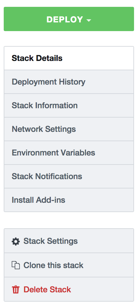
We also moved the context menu items out and put them on the right handside of the page to make it easier to navigate to your favourite features.

We hope you like the new UI and dashboard improvements. Let us know what you think and how we can make it even more awesome!
