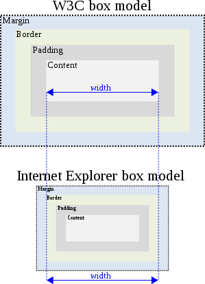
A handy CSS3 tip that you might not have got around to trying is the use of the box-sizing property. This now has support in IE8 and above setting box-sizing: border-box allows you to use the more natural CSS box model and makes building CSS layouts easier.
A brief box model history
Back in the early days of the web standards movement we learned the importance of using the right
DOCTYPE and the difference between standards and quirks mode rendering.
Most of us learned the hard way that triggering quirks mode in IE would break our layouts. The reason behind this was the differing implementation of the Microsoft and W3C box model used by standards compliant browsers:
- W3C Box model :
width+padding+border= rendered width
of the box. - IE Quirks mode Box Model :
width= actual rendered width of box
withborderandpaddingvalues applied inward.

Despite being an annoyance for the past ten years or so it turns out that the Microsoft implementation is more natural to work with and generally makes CSS layout more intuitive.
If you’d like to try it just use the universal CSS selector to apply it globally to your project:
Now you can set your column widths as a percentage of 100 then add your desired padding and no longer will this break your layout! :)
If your unlucky enough to still have to support IE6 and IE7 you might want to check out this pollyfill:
- box-sizing
pollyfill by
@derSchepp
